Colors influence how we describe the world, from scientific studies and academic writing to art, design, and creative expression. Understanding Violet vs Indigo vs Purple helps clear up common color confusion because these shades often look similar but have different identities. While violet and indigo relate closely to the visible light spectrum and wavelengths of light, purple is a non-spectral color created through human color perception and the mixing of red and blue light.
Violet is a true spectral color found within the visible light spectrum, appearing at approximately 380–450 nanometers in wavelength. It has shorter wavelengths and higher energy light than other visible colors, giving it a distinct bluish appearance. Because it exists naturally in the rainbow colors and visual spectrum, violet holds an important place in the science of colors and color classification.
Indigo is more complex and remains a topic of discussion in color theory. Sir Isaac Newton included indigo in his color spectrum, placing it between blue and violet at around 445–464 nanometers. However, the status of indigo as a separate spectral color is debated, as some scientists view it as part of the blue and violet range rather than a clearly distinct color. This makes indigo vs violet a common comparison in studies of the visible spectrum.
Purple, unlike violet and indigo, is a non-spectral color created through human color perception. The brain recognizes purple when the eyes detect a combination of red and blue light, whether through the RGB color model or pigment mixing in art and design. This unique process connects purple with visual perception, color psychology, symbolism of colors, and creative applications in fashion, branding, and artistic expression.
This guide explores their wavelengths, rainbow colors, color classification, symbolism, cultural meaning, design applications, and visual comparison. Keep reading to understand how violet, indigo, and purple differ in science, art, and everyday language.
What Is Purple ?
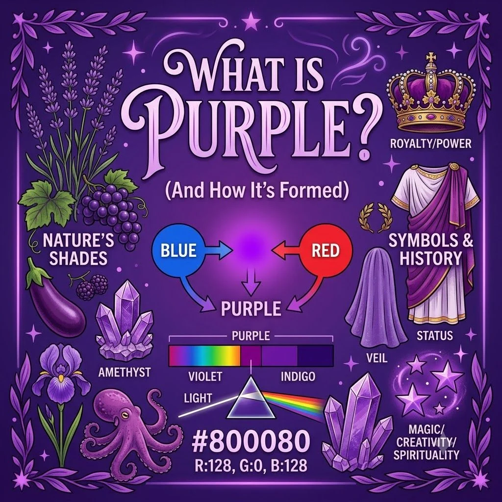
Purple is a color created when the human eye and brain perceive a combination of red and blue light. Unlike violet, purple is a non-spectral color, which means it does not appear as a single wavelength in the visible light spectrum. Instead, it is produced through color perception, light mixing, or pigment blending in art and design.
Purple has a unique place between science and creativity. In the RGB color model, digital screens create purple by combining red and blue light values. In traditional art, painters and designers often create purple by mixing red and blue pigments. Because purple depends on how the brain interprets different light signals, its appearance can vary based on lighting, surrounding colors, and visual context.
The term purple color covers a wide range of shades, including lavender, plum, violet-purple, and deep royal purple. While people often use “purple” and “violet” interchangeably in everyday language, they represent different ideas in color theory and visual perception.
Key Characteristics:
- Non-spectral color: Purple does not have its own single wavelength in the visible spectrum. It appears when the brain combines signals from red and blue light.
- Created through mixing: Purple can result from red and blue light combinations or from mixing red and blue pigments.
- Human perception-based: The appearance of purple depends on how the eyes detect light and how the brain processes color information.
- Wide range of shades: Purple includes many variations, from soft lavender to rich violet-purple and dark royal tones.
- Important in art and design: Artists, designers, and brands use purple for its emotional impact, visual identity, and symbolic meanings.
- Connected with color psychology: Purple is often associated with creativity, imagination, luxury, spirituality, and mystery in different cultures.
Example Sentences:
- The designer chose purple for the logo because it created a feeling of creativity and elegance.
- Purple appears when the human eye detects a mixture of red and blue light.
- The artist mixed blue and red pigments to create a deep purple shade for the painting.
- Many people confuse purple with violet because both colors appear in the blue-red range of human color perception.
Sentence Breakdown:
Sentence: The designer chose purple for the logo because it created a feeling of creativity and elegance.
- Purple → The main color being described.
- Designer chose → Shows the practical use of purple in a creative field.
- Logo → Demonstrates how color choices influence branding and visual identity.
- Creativity and elegance → Explains the emotional associations connected with purple.
This sentence shows that purple is not only a visual color but also a tool used in communication, design, and emotional expression.
What Is Indigo?
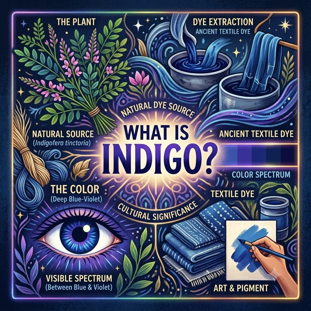
Indigo is a deep blue-purple color traditionally placed between blue and violet in the color spectrum. It became widely recognized after Sir Isaac Newton included indigo as one of the colors in his description of the rainbow spectrum. However, modern discussions in color science often debate whether indigo should be considered a separate spectral color or simply part of the blue-violet range.
Unlike purple, indigo is connected to a specific region of the visible light spectrum. It is generally associated with wavelengths around 445–464 nanometers, although the exact range can vary depending on scientific classification. Because indigo sits close to violet, many people struggle to identify the difference between indigo vs violet.
Indigo also has strong cultural and artistic importance. The color has been used in natural dyes, textiles, paintings, and digital design. Its deep blue appearance often gives it associations with calmness, depth, wisdom, and tradition.
Key Characteristics:
- Spectral color classification: Indigo is traditionally considered part of the visible spectrum, although its classification remains debated.
- Position in the spectrum: It appears between blue and violet, making it a transition color in the rainbow.
- Wavelength range: Indigo is commonly linked with approximately 445–464 nanometers.
- Historical connection: Sir Isaac Newton included indigo in his seven-color model of the spectrum.
- Blue-violet appearance: Indigo usually looks deeper and more blue compared with violet.
- Used in art and culture: Indigo pigments and dyes have played an important role in textiles, painting, and creative design.
Example Sentences:
- The artist used indigo paint to create a deep blue-purple background.
- Indigo appears between blue and violet in traditional rainbow color classifications.
- Many cultures have used indigo dye to create rich colors in fabrics and artwork.
- Scientists continue to discuss whether indigo should be classified as a separate spectral color.
Sentence Breakdown:
Sentence: Indigo appears between blue and violet in traditional rainbow color classifications.
- Indigo → The specific color being discussed.
- Appears between → Describes its location in the color spectrum.
- Blue and violet → Shows the relationship between neighboring colors.
- Traditional rainbow color classifications → Refers to historical ways of organizing visible colors.
This sentence explains why indigo is often confused with violet and why understanding its position helps clarify color differences.
What Is Violet?
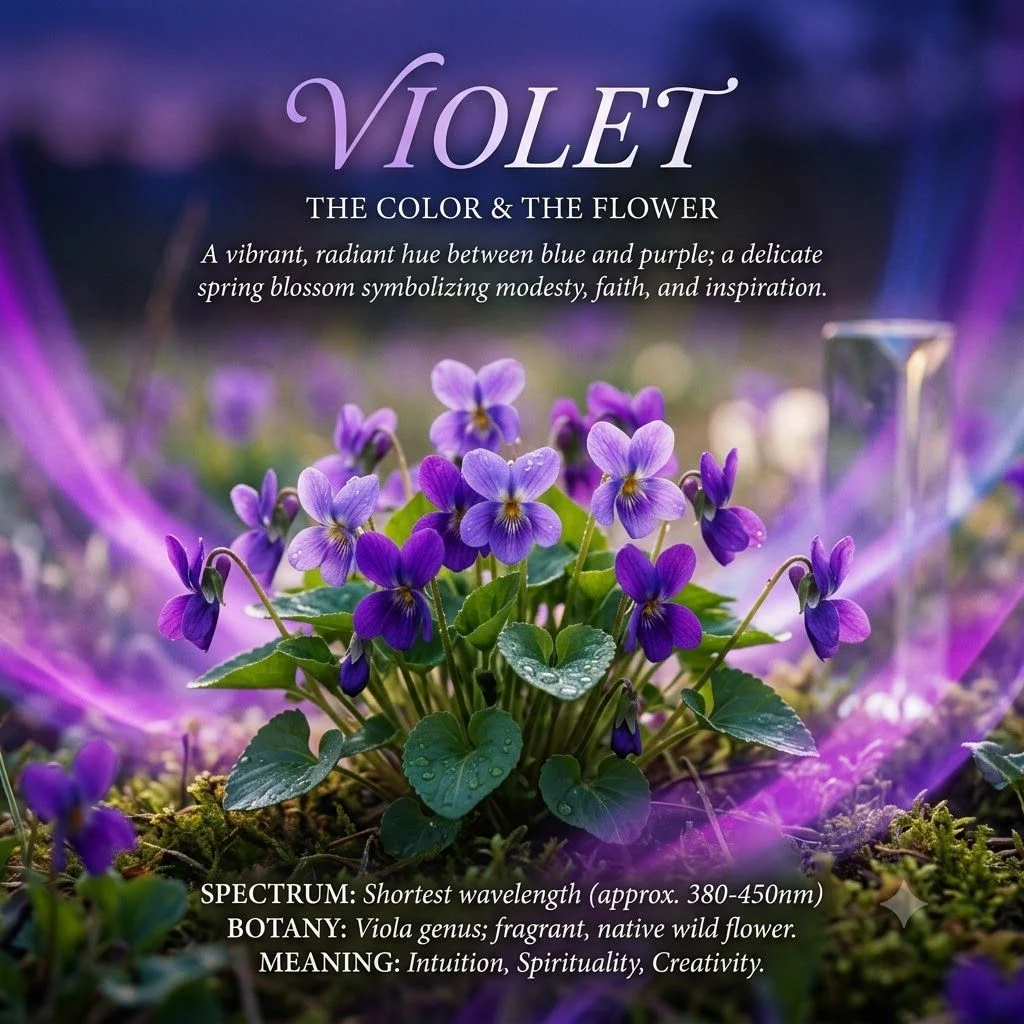
Violet is a true spectral color found at the shorter wavelength end of the visible light spectrum. It appears at approximately 380–450 nanometers and contains the highest energy light among the colors humans can see. Violet is often described as a bluish-purple color, but scientifically it differs from purple because it exists as a natural wavelength of light.
Violet plays an important role in color science, visual perception, and light detection. When light enters the human eye, specialized cells called photoreceptors detect different wavelengths, allowing the brain to recognize violet as a distinct color. This process makes violet part of the natural visual spectrum rather than a color created by mixing other wavelengths.
In everyday language, people often use violet and purple as similar terms. However, in scientific contexts, violet refers to a specific spectral color, while purple describes a perception created by combining red and blue signals.
Key Characteristics:
- Spectral color: Violet exists naturally as a single wavelength of light within the visible spectrum.
- Short wavelength: It has shorter wavelengths than other visible colors, ranging from about 380–450 nanometers.
- Higher energy light: Violet carries more energy compared with colors with longer wavelengths.
- Bluish appearance: Violet often appears closer to blue than many shades of purple.
- Part of rainbow colors: Violet appears at one end of the natural rainbow spectrum.
- Important in science and design: Violet influences studies of light, color perception, digital representation, and artistic expression.
Example Sentences:
- Violet is the shortest wavelength color visible in the human light spectrum.
- The flower had a bright violet color that looked different from deep purple shades.
- Scientists study violet light to understand wavelength behavior and human vision.
- The designer selected violet to create a bold and energetic visual style.
Sentence Breakdown:
Sentence: Violet is the shortest wavelength color visible in the human light spectrum.
- Violet → Identifies the specific spectral color.
- Shortest wavelength color → Explains its scientific property.
- Visible in the human light spectrum → Connects violet with human vision and the visible range of light.
This sentence highlights the scientific difference between violet and other similar-looking colors such as indigo and purple.
Which Color Is Darker?
When comparing indigo vs violet vs purple, the darkest appearance usually depends on the exact shade, lighting conditions, and how the color is produced. In general, indigo is often considered the darkest because it contains a deep blue tone that absorbs more light visually. Purple can also appear very dark, especially in rich shades like royal purple or deep plum. Violet, however, is usually brighter and more vivid because it belongs to the shorter wavelength range of the visible light spectrum.
The perceived darkness of these colors changes based on context. A dark purple pigment may look deeper than a light indigo shade, while a bright violet light may appear more intense than both. In digital design, RGB color values control brightness, while in art and painting, pigment quality and mixing techniques affect how dark a color appears.
Understanding these differences helps in color selection, design discussions, visual communication, and artistic expression. While all three colors belong to the blue-purple family, their unique properties create different visual effects.
Indigo vs Violet vs Purple: Key Differences at a Glance
| Feature | Violet | Indigo | Purple |
| Color Type | Spectral color | Traditionally considered a spectral color | Non-spectral color |
| Light Spectrum Position | Between ultraviolet and blue | Between blue and violet | Not found as a single wavelength |
| Approximate Wavelength | 380–450 nanometers | 445–464 nanometers | No specific wavelength |
| Color Appearance | Bluish and bright | Deep blue with violet tones | Mix of red and blue appearance |
| Scientific Classification | Natural wavelength of light | Historically classified by Sir Isaac Newton | Created through human color perception |
| How It Forms | Exists naturally in visible light | Appears in the blue-violet range | Produced by mixing red and blue light or pigments |
| Energy Level | Higher energy due to shorter wavelength | Lower than violet but higher than longer wavelengths | Depends on the light mixture |
| Common Confusion | Often mistaken for purple | Often confused with violet | Commonly used as a general term for violet shades |
| Art and Design Use | Creates vivid, mystical, and energetic effects | Adds depth, richness, and sophistication | Represents creativity, luxury, and emotion |
| Typical Darkness | Usually lighter and more vibrant | Often appears darkest due to deep blue tones | Can range from light lavender to very dark shades |
Historical and Cultural Context
Colors have carried meanings beyond their physical appearance for centuries. Violet, indigo, and purple have influenced art, fashion, religion, royalty, and cultural traditions around the world. Their meanings developed through natural sources, historical events, and human interpretation of color.
Violet
Violet has long been connected with spirituality, imagination, and mystery because of its rare appearance in nature and its position at the edge of the visible light spectrum. Ancient societies often associated violet shades with special qualities because natural violet pigments were difficult to obtain.
In art and design, violet became a symbol of creativity, individuality, and transformation. Artists use violet tones to create contrast, depth, and emotional expression. In modern contexts, violet appears in branding, fashion, and digital design because of its unique balance between blue and purple characteristics.
The scientific understanding of violet also gives it a special identity. Unlike purple, violet exists as a true spectral color, making it important in studies of light wavelengths, color perception, and visual science.
Indigo
Indigo has a rich cultural history connected to natural dyes and textiles. For thousands of years, people extracted indigo dye from plants to create deep blue fabrics. These dyes became valuable trade products and played important roles in clothing, art, and cultural traditions.
The historical connection between indigo and Sir Isaac Newton also shaped how people understand the color today. Newton included indigo as one of the seven colors in his description of the rainbow, placing it between blue and violet. Although scientists continue to debate whether indigo is a distinct spectral category, it remains an important part of traditional color classification.
Across cultures, indigo often represents depth, wisdom, stability, and tradition. Its strong presence in fashion, painting, and design continues today.
Purple
Purple has historically represented wealth, power, and status because certain purple dyes were once extremely rare and expensive. In ancient societies, especially among royalty and elites, purple clothing symbolized importance and prestige.
Unlike violet and indigo, purple is created through color mixing rather than a single wavelength of light. This unique quality made purple especially important in art because artists could create many variations by adjusting the balance between red and blue pigments.
Today, purple carries many meanings, including creativity, imagination, luxury, and individuality. Designers often use purple to create memorable visual identities, while artists use it to express emotion and atmosphere. Its cultural symbolism continues to evolve across different societies and creative fields.
Why Do People Confuse Indigo vs Violet?
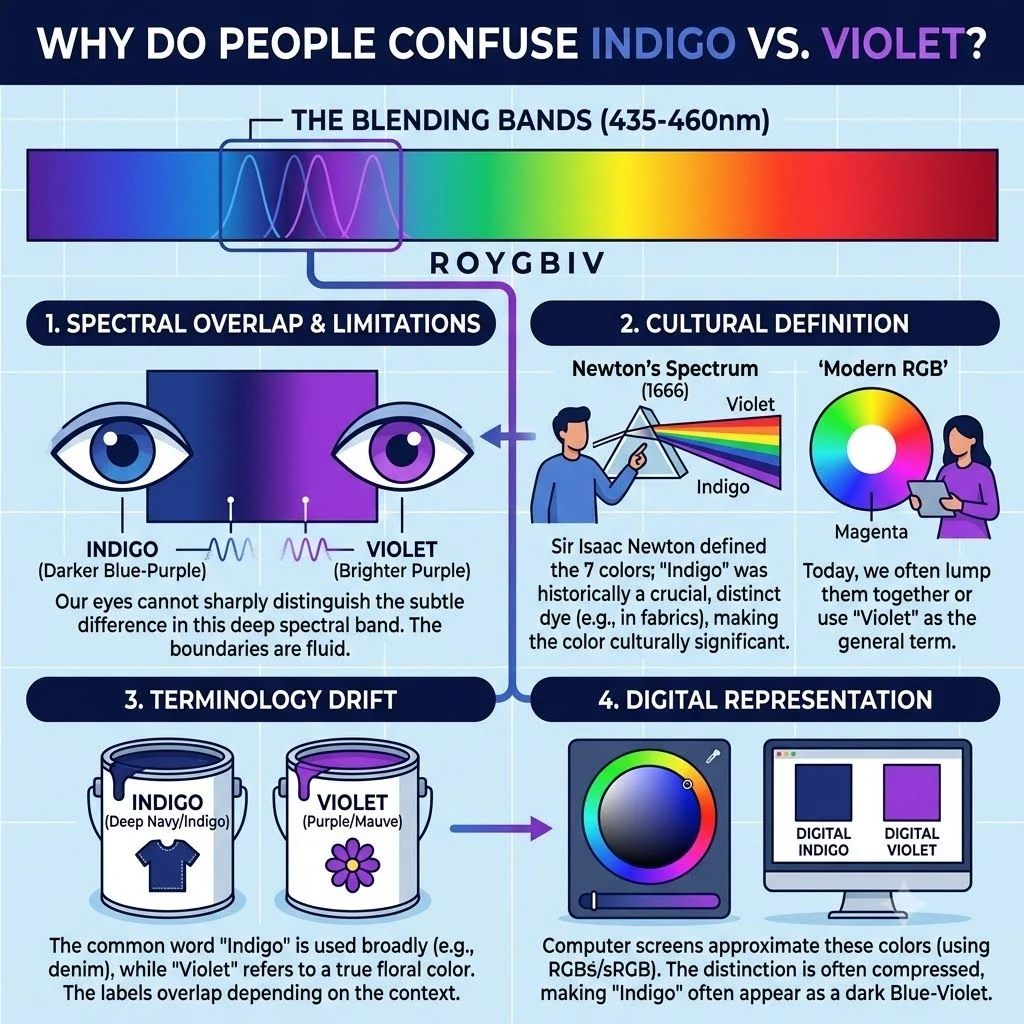
People often confuse indigo vs violet because both colors appear close together in the visible light spectrum and share similar blue-purple tones. In everyday conversations, many people use these terms interchangeably because their visual differences can be subtle, especially under different lighting conditions or on digital screens.
The confusion also comes from the way colors are classified. Violet has a clear scientific definition as a spectral color with its own wavelength range, while indigo’s classification is more debated. Historically, Sir Isaac Newton included indigo as a separate color in the rainbow, but modern color science often considers it part of the transition between blue and violet.
Another reason for confusion is cultural and artistic usage. Artists, designers, and brands may use indigo, violet, and purple differently depending on the shade, pigment, or visual effect they want to create. Understanding their differences requires looking at wavelengths, light perception, color theory, and practical color usage.
Common Grammar Confusions Table
| Comparison | Indigo | Violet |
| Color Classification | Traditionally considered a spectral color, but debated in modern science | A confirmed spectral color |
| Position in Visible Spectrum | Between blue and violet | Near the end of the visible spectrum after blue |
| Approximate Wavelength | Around 445–464 nanometers | Around 380–450 nanometers |
| Appearance | Deeper blue with purple hints | Brighter bluish-purple shade |
| Scientific Status | Sometimes viewed as part of the blue-violet range | Recognized as a distinct wavelength of light |
| Common Confusion | Mistaken for dark blue or violet | Mistaken for purple or indigo |
| Usage Context | Common in dyes, fashion, and cultural references | Common in science, optics, and color studies |
Causes of Errors:
Several factors cause mistakes when identifying indigo and violet:
- Similar visual appearance: Both colors contain blue and purple qualities, making them difficult to separate without close comparison.
- Different screens and displays: Digital devices use the RGB color model, which can change how shades appear.
- Lighting conditions: Natural light, artificial lighting, and surrounding colors can affect color perception.
- Everyday language: People often use “purple,” “violet,” and “indigo” as general terms for similar shades.
- Different color systems: Scientific classification, artistic color names, and cultural meanings do not always match perfectly.
Learning the difference helps improve color communication in fields such as design, education, photography, science, and creative work.
Wavelength and Light Spectrum
Colors exist because visible light contains different wavelengths that the human eye can detect. The visible light spectrum ranges from shorter wavelengths like violet to longer wavelengths like red. Each wavelength creates a different response in the eye, allowing humans to recognize different colors.
Violet and indigo belong to the blue-purple region of this spectrum. Their close position explains why they often appear similar. However, their wavelength ranges and scientific descriptions help distinguish them.
Violet represents one of the shortest visible wavelengths, while indigo occupies a region between blue and violet. These differences are important in optics, physics, color science, and visual perception.
Violet as a Spectral Color
Violet is a true spectral color, meaning it exists as a single wavelength of light rather than a mixture of other colors. It appears at approximately 380–450 nanometers and represents the highest-energy end of the visible spectrum.
When violet light enters the human eye, specialized cells detect its wavelength, and the brain interprets it as violet. This process makes violet scientifically different from purple, which requires a combination of red and blue signals.
Because of its place in the light spectrum, violet plays an important role in studies of wavelengths of light, color perception, and visual science. It also appears naturally in rainbows and influences many areas of art and design.
Indigo’s Place in the Rainbow
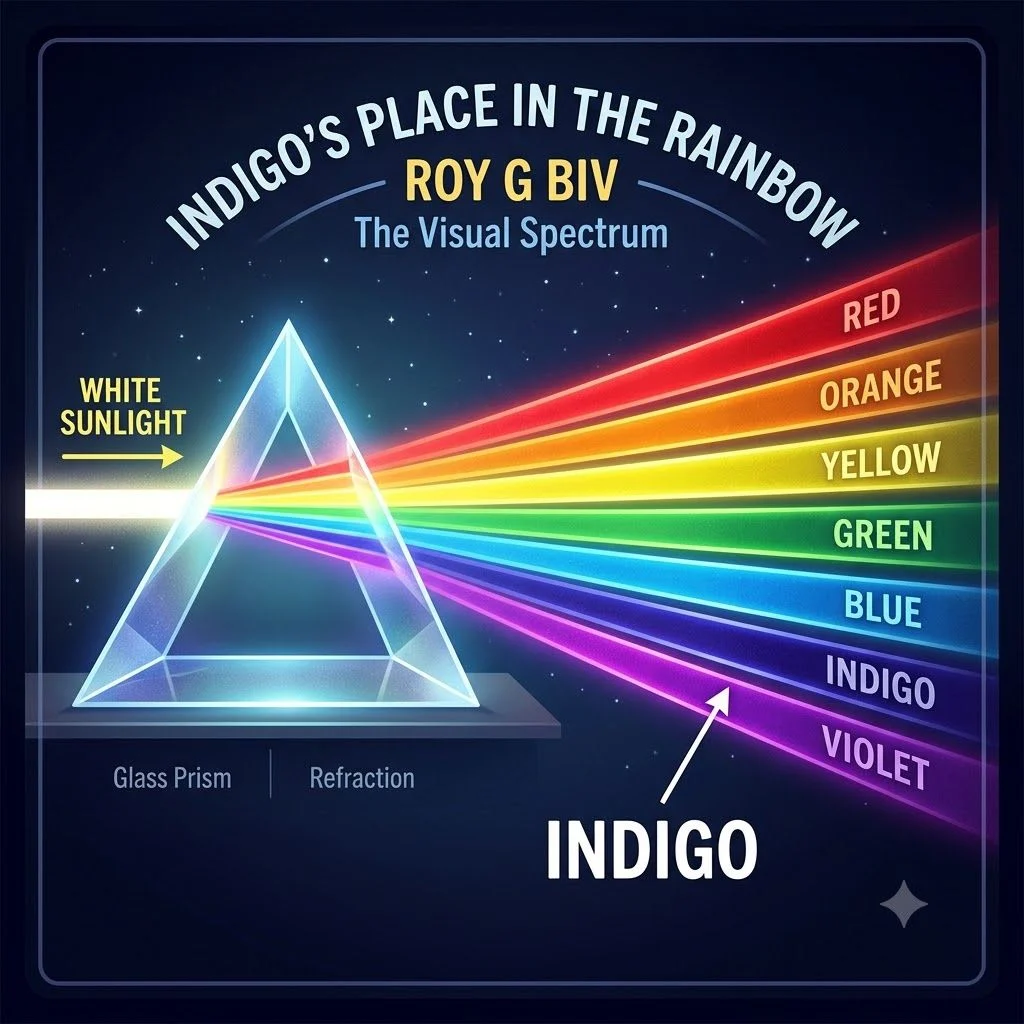
Indigo has traditionally been placed between blue and violet in rainbow color classifications. This position comes mainly from Sir Isaac Newton’s historical color spectrum, where he identified seven rainbow colors.
However, indigo remains a debated color category among scientists and color experts. Some researchers argue that the human eye does not clearly separate indigo from deep blue or violet, making it more of a cultural and artistic distinction than a completely separate spectral category.
Despite this debate, indigo remains an important color in art, fashion, textiles, and design. Its deep blue-purple appearance gives it a unique identity, especially when compared with the brighter appearance of violet.
Purple as a Non-Spectral Color
Purple differs from both indigo and violet because it is a non-spectral color. It does not appear as a single wavelength in the visible light spectrum. Instead, the brain creates the perception of purple when the eyes receive signals from both red and blue light.
This unique quality makes purple an example of human color perception rather than a direct representation of one wavelength. In digital design, purple is created through the RGB color model, while artists often create it by mixing red and blue pigments.
Purple has a wide range of shades, from soft lavender to deep royal purple. Its flexibility makes it popular in art, branding, fashion, and visual communication, where it often represents creativity, imagination, and elegance.
Indigo vs Violet vs Purple in Fashion
Fashion uses color not only for appearance but also for expressing personality, mood, and style preferences. Indigo, violet, and purple each create a different visual impact because of their unique tones, cultural meanings, and relationships within color theory.
Violet often creates a bold and artistic look because of its connection with brightness and the shorter wavelengths of the visible spectrum. Indigo provides a deeper, more balanced appearance with strong blue influences, making it popular for elegant and timeless outfits. Purple, with its combination of red and blue qualities, offers flexibility and works across many styles, from luxury fashion to casual wear.
Designers consider factors such as skin tone, fabric texture, lighting, and color harmony when choosing between these shades. Understanding the difference between these colors helps people make better fashion choices and create outfits with the desired emotional and visual effect.
Violet Fashion Trends

Violet fashion is often associated with creativity, confidence, and individuality. Its bright yet sophisticated appearance makes it a popular choice for statement clothing, accessories, and modern designs.
Violet shades appear frequently in:
- Evening wear: Violet dresses, suits, and formal outfits create an elegant and artistic appearance.
- Accessories: Bags, shoes, and jewelry in violet tones add a unique visual highlight.
- Modern fashion collections: Designers use violet to create fresh, expressive looks.
Because violet has a strong connection with the visual spectrum, it often appears more vibrant than deeper purple shades. Light violet tones can create a soft and romantic style, while darker violet shades provide a more dramatic and luxurious feel.
Indigo Clothing Styles
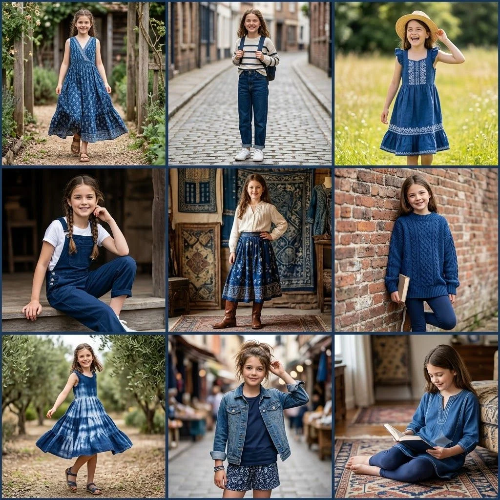
Indigo clothing is known for its deep, rich, and classic appearance. It combines the calm qualities of blue with subtle purple undertones, making it a versatile color in fashion.
Common uses of indigo include:
- Denim styles: Indigo remains one of the most recognized shades for jeans and casual clothing.
- Traditional textiles: Many cultures have used indigo dye for fabrics and handcrafted designs.
- Formal clothing: Dark indigo suits and dresses create a refined and professional look.
Indigo works well because it feels both modern and timeless. Its darker tone often gives clothing a sense of depth, stability, and sophistication.
Purple as a Fashion Statement
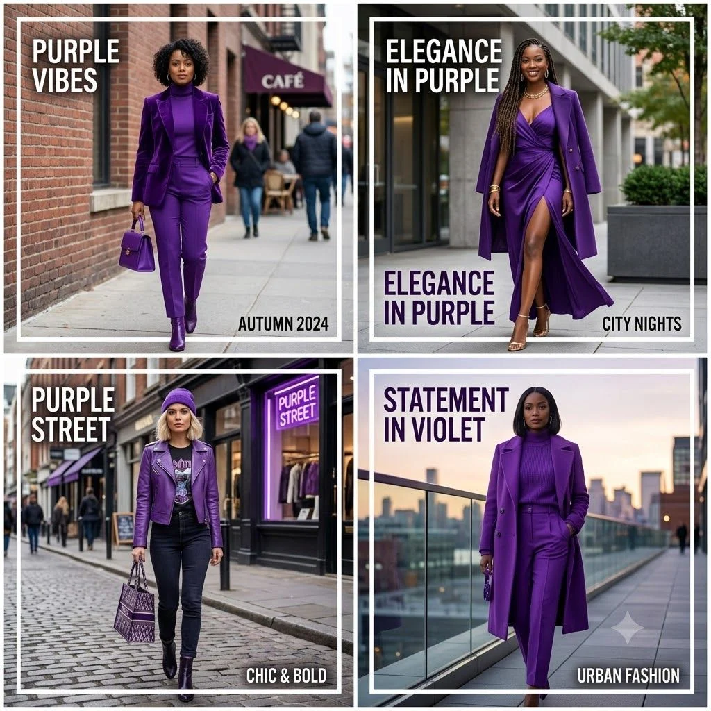
Purple fashion stands out because of its wide range of shades and strong emotional associations. From soft lavender to deep royal purple, this color can create different impressions depending on its intensity.
Purple is often used to express:
- Luxury and elegance: Rich purple shades are connected with premium and stylish designs.
- Creativity and imagination: Bright purple tones create energetic and artistic appearances.
- Individuality: Purple clothing helps people create memorable personal styles.
Unlike violet and indigo, purple is not a single spectral color. Its appearance comes from the combination of red and blue qualities, giving designers more flexibility when creating different shades.
How to Choose the Right Shade
Choosing between violet, indigo, and purple depends on personal style, purpose, and the effect you want to create.
- Choose violet when you want a bright, expressive, and creative look.
- Choose indigo when you prefer a deep, classic, and professional appearance.
- Choose purple when you want versatility and a balance between warm and cool tones.
Other factors also matter:
- Skin tone: Some shades may complement warmer or cooler undertones differently.
- Lighting: Colors can appear different under natural and artificial light.
- Fabric type: Materials like silk, cotton, and velvet reflect colors differently.
- Occasion: Formal events may suit deeper shades, while casual styles may work well with lighter tones.
Read More: Annunciate vs Enunciate: Understanding the Difference in 2026
How Violet Affects Mood
Violet often creates feelings connected with imagination, creativity, and inspiration. Because it combines blue-like calmness with a brighter visual presence, it can feel both peaceful and energetic.
In color psychology, violet is often linked with:
- Creativity
- Spirituality
- Mystery
- Innovation
- Artistic expression
The emotional response to violet can vary depending on the shade. Light violet may feel gentle and calming, while deep violet can create a sense of luxury and intensity.
How Indigo Influences Emotions
Indigo is commonly associated with depth, balance, and calmness because of its strong connection with blue. Its darker appearance often creates a feeling of stability and trust.
Indigo is frequently connected with:
- Wisdom
- Focus
- Inner reflection
- Reliability
- Sophistication
In fashion and design, indigo can create a grounded and professional atmosphere. Its deep tone often feels more serious and traditional compared with brighter violet shades.
How Purple Impacts Human Perception
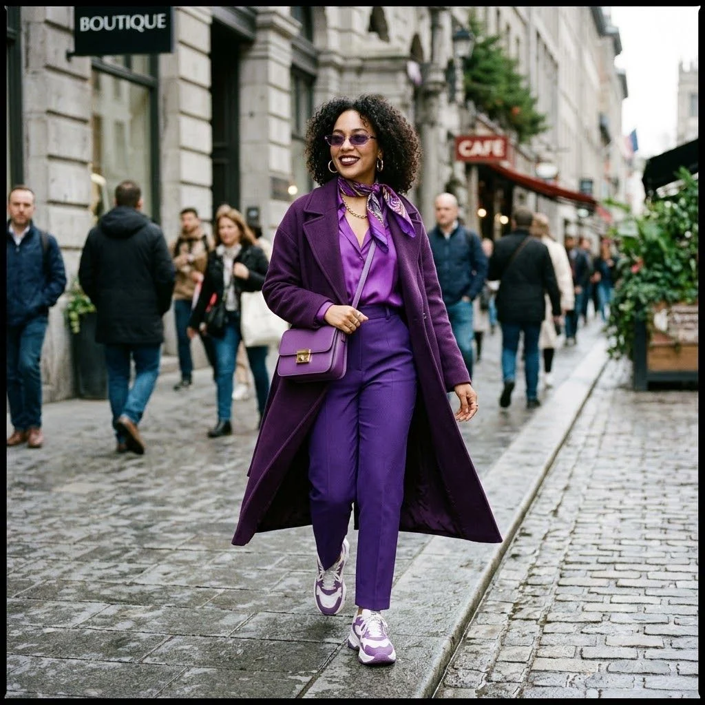
Purple creates a unique emotional response because the brain interprets it through a combination of red and blue signals. This gives purple both warm and cool qualities.
Purple is often associated with:
- Creativity
- Luxury
- Imagination
- Ambition
- Individuality
Since purple includes many variations, its effect depends on the specific shade. Light purple may appear soft and peaceful, while dark purple can feel powerful and dramatic.
Color Psychology Differences
| Color | Emotional Associations | Common Psychological Effects | Typical Impression |
| Violet | Creativity, imagination, spirituality | Encourages artistic thinking and inspiration | Expressive and unique |
| Indigo | Wisdom, calmness, stability | Creates feelings of depth and focus | Professional and timeless |
| Purple | Luxury, ambition, creativity | Balances energy and calmness through red-blue perception | Elegant and versatile |
Scientific Differences Between Indigo, Violet, and Purple
| Feature | Violet | Indigo | Purple |
| Scientific Classification | Spectral color | Traditionally spectral, but debated | Non-spectral color |
| Visible Spectrum Position | Near the shorter wavelength end | Between blue and violet | Not located as a single spectrum wavelength |
| Approximate Wavelength | 380–450 nanometers | 445–464 nanometers | No single wavelength |
| Light Formation | Exists as a natural wavelength of light | Appears within the blue-violet range | Created by mixing red and blue light |
| Energy Level | Higher energy due to shorter wavelength | Slightly lower than violet | Depends on the light combination |
| Human Perception | Detected directly through violet wavelengths | Interpreted from blue-violet light responses | Created by the brain through combined color signals |
| Color Theory Category | Primary spectral color | Transitional spectrum color | Perceptual color created through mixing |
| Common Applications | Science, optics, art, design | Textiles, fashion, traditional dyes | Branding, art, digital design, fashion |
Usage in Different Contexts
The way people use violet, indigo, and purple depends on the situation, purpose, and audience. These colors appear in everyday descriptions, professional communication, creative projects, and online conversations. Although people often use these terms interchangeably, each color carries a slightly different visual identity and meaning.
Understanding the correct use of these color names improves color communication and helps people describe objects, designs, emotions, and ideas more accurately. In fields such as fashion, branding, photography, and digital design, choosing the right color term can create a clearer visual message.
1. Everyday Conversation
In everyday conversations, people often use purple as a general term for many blue-red shades, including violet-like colors. Most casual speakers do not separate violet, indigo, and purple unless the exact shade matters.
Examples:
- “She wore a purple dress to the event.”
- “The sunset had violet tones.”
- “The fabric looked deep indigo in the sunlight.”
When describing common objects, purple is usually the easiest and most familiar word. However, people may choose violet when describing flowers, light, or artistic shades, while indigo often refers to deep blue-purple colors found in clothing or dyes.
2. Professional Writing
In professional writing, accurate color terminology creates clearer communication. Industries such as graphic design, fashion, marketing, photography, and product development often require precise color descriptions.
For example:
- A designer may specify a violet shade for a digital interface.
- A clothing brand may describe fabric as indigo-dyed denim.
- A marketing team may select purple branding elements to represent creativity and luxury.
Using the correct color term helps avoid confusion when teams work with color palettes, digital color systems, pigments, and visual identity guidelines.
3. Creative Writing
Creative writers use colors to create imagery, emotion, and atmosphere. Violet, indigo, and purple can suggest different moods depending on the context.
Examples:
- Violet skies may suggest mystery, beauty, or imagination.
- Indigo nights can create feelings of depth, calmness, and silence.
- Purple flowers may symbolize elegance, romance, or creativity.
Writers often choose these words based on emotional impact rather than strict scientific classification. A carefully selected color name can make descriptions more vivid and memorable.
4. Social Media/Texting
On social media and in texting, people usually use purple as a broad color term because it is widely recognized. Emojis, captions, and digital posts often simplify color names for quick communication.
Examples:
- “Purple outfit today 💜”
- “This violet sunset looks amazing.”
- “Loving this indigo aesthetic.”
Digital screens also affect how colors appear because devices display colors through the RGB color model. The same shade may look slightly different depending on screen settings, brightness, and display quality.
Read More: Newfound vs New-Found: What’s The Difference 2026
Symbolism and Emotional Interpretation
Colors influence how people interpret images, designs, and messages. Violet, indigo, and purple have developed different symbolic meanings through history, culture, art, and human perception.
Although meanings vary across societies, these colors often appear in discussions about color psychology, emotional impact, and visual communication.
Violet Symbolism
Violet is commonly associated with creativity, imagination, spirituality, and transformation. Because it exists at the shorter wavelength end of the visible light spectrum, it often feels distinctive and visually powerful.
Common symbolic meanings of violet include:
- Creativity and inspiration
- Mystery and imagination
- Spiritual awareness
- Individuality
- Artistic expression
In design and branding, violet can create a feeling of originality and innovation. Its connection with both blue and purple qualities allows it to feel calm while still attracting attention.
Indigo Symbolism
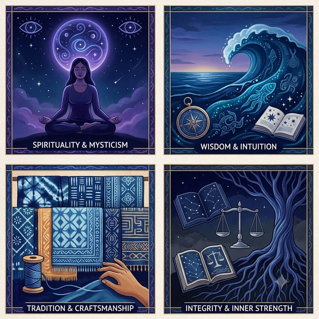
Indigo often represents depth, wisdom, stability, and reflection. Its strong blue influence gives it a calm and serious appearance, while its violet undertones add richness.
Common symbolic meanings of indigo include:
- Knowledge and wisdom
- Trust and reliability
- Inner thinking
- Calmness
- Tradition
Because of its historical connection with natural dyes and textiles, indigo also carries cultural importance in many regions around the world.
Purple Symbolism
Purple has long been connected with luxury, creativity, and power. Historically, rare purple dyes made the color difficult to produce, which contributed to its association with royalty and status.
Common symbolic meanings of purple include:
- Elegance and luxury
- Creativity and imagination
- Ambition
- Individuality
- Emotional expression
In modern design, purple is often used to create a memorable and sophisticated visual identity.
These Colors in Nature
Nature provides many examples of violet, indigo, and purple shades through flowers, minerals, animals, and atmospheric effects. These colors appear because of different pigments, light interactions, and natural structures.
Violet in Nature
Violet appears in many natural settings, especially in flowers and light phenomena. Some plants produce violet shades through natural pigments that reflect specific wavelengths of light.
Examples include:
- Violet flowers
- Certain gemstones
- Some butterfly wings
- Rainbow displays
Because violet is a true spectral color, it can also appear through natural light conditions where shorter wavelengths become visible.
Indigo in Nature
Indigo is commonly associated with deep blue-purple natural colors. Although pure indigo light classification is debated, the shade appears frequently in natural dyes and organic materials.
Examples include:
- Indigo dye from plants
- Deep blue flowers
- Certain animal markings
- Ocean and sky tones under specific lighting
The natural indigo pigment has been historically important for creating textiles and artistic materials.
Purple in Nature
Purple is one of the most recognizable colors in nature because many organisms produce purple-like appearances through pigments and light effects.
Examples include:
- Lavender flowers
- Purple grapes
- Certain minerals
- Butterfly wings
- Some fruits and plants
Purple shades in nature often result from combinations of pigments rather than a single wavelength of light.
Color Mixing in Art and Design
Artists and designers use violet, indigo, and purple differently depending on the desired mood, contrast, and visual effect. Understanding how these colors are created helps explain their differences in paintings, digital graphics, and branding.
Violet
Artists create violet through different methods depending on the medium. In traditional painting, violet may come from specific pigments or mixtures that produce a bluish-purple appearance.
Violet is often used for:
- Creating contrast with warm colors
- Adding mystery and depth
- Highlighting creative themes
- Producing elegant visual effects
In digital design, violet shades are created using specific RGB values that combine red and blue light.
Indigo
Indigo is often created through deep blue pigments with subtle purple influences. It has a darker and more grounded appearance compared with violet.
Artists use indigo for:
- Night scenes
- Dramatic shadows
- Textile designs
- Traditional artwork
Its strong connection with natural dye history makes it an important color in both traditional and modern design.
Purple
Purple is commonly created by mixing red and blue pigments or combining red and blue light in digital systems. The balance between these colors determines whether purple appears warmer, cooler, lighter, or darker.
Designers use purple for:
- Branding and marketing
- Luxury visuals
- Creative projects
- Fashion designs
Because purple has many variations, it provides artists with a wide range of expressive possibilities.
Read More: Family and Friends or Friends and Family: Which Is Correct?
Indigo vs Violet vs Purple in Digital Design
In digital design, choosing between indigo, violet, and purple requires more than simply selecting a similar-looking shade. Digital colors depend on factors such as screen technology, color models, brightness settings, and numerical color values. Although these colors belong to the same blue-purple family, they create different visual effects in websites, apps, branding, and user interfaces.
Violet often appears brighter and more energetic because of its connection with the shorter wavelength range of the visible spectrum. Indigo creates a deeper and more balanced appearance because of its strong blue influence. Purple offers the widest range of digital variations because designers can adjust the balance between red and blue values.
Understanding these differences helps designers create better visual identity, accessibility, contrast, and user experiences. A carefully selected color palette can improve readability, emotional impact, and overall design consistency.
Hex Codes and Color Values
Digital designers use hex codes to define exact colors on websites, applications, and digital platforms. A hex code is a six-character value that represents the amount of red, green, and blue (RGB) light used to create a color.
Examples of commonly used shades include:
| Color | Example Hex Code | Visual Description |
| Violet | #8F00FF | Bright blue-purple shade |
| Indigo | #4B0082 | Deep blue-purple shade |
| Purple | #800080 | Balanced red-blue shade |
These values are not universal definitions because designers can create thousands of variations by adjusting brightness, saturation, and contrast. A color labeled “violet” in one design system may appear slightly different from another because of different color standards.
Hex codes help maintain consistency across:
- Websites
- Mobile applications
- Branding materials
- Digital illustrations
- User interface designs
Using accurate color values ensures that designers, developers, and marketing teams understand the intended shade.
RGB and CMYK Differences
RGB (Red, Green, Blue) is mainly used for digital screens. Devices such as smartphones, monitors, and televisions create colors by combining light. Violet, indigo, and purple shades appear through different combinations of RGB values.
CMYK (Cyan, Magenta, Yellow, Black) is mainly used for printing. Printers create colors by combining inks rather than light. Because ink and light behave differently, a purple or violet shade on a screen may not look exactly the same when printed.
Key differences:
| Feature | RGB | CMYK |
| Main Use | Digital screens | Printed materials |
| Color Creation | Mixing light | Mixing ink |
| Common Applications | Websites, apps, videos | Posters, brochures, packaging |
| Color Appearance | Brighter and more vibrant | Often darker and less intense |
Designers must convert colors carefully between RGB and CMYK to avoid unexpected changes in violet, indigo, and purple shades.
Choosing Colors for Websites and Apps
Selecting the right shade of violet, indigo, or purple can influence how users experience a website or application. Each color creates a different visual impression.
Violet works well for:
- Creative websites
- Artistic platforms
- Innovation-focused brands
- Modern interfaces
Its brighter appearance can attract attention but may require careful contrast choices.
Indigo works well for:
- Professional websites
- Technology platforms
- Educational apps
- Trust-focused designs
Its deeper tone often creates a sense of reliability and stability.
Purple works well for:
- Lifestyle brands
- Beauty platforms
- Entertainment apps
- Premium products
Its flexibility allows designers to create both playful and luxurious styles.
When choosing colors, designers should consider:
- Accessibility: Text and backgrounds should have enough contrast.
- Brand identity: Colors should match the message a brand wants to communicate.
- User expectations: Different industries often use colors in different ways.
- Screen appearance: Colors may change across devices and displays.
Common Digital Color Mistakes
Many digital designers make mistakes when working with violet, indigo, and purple because these shades can appear similar on screens. Small changes in color values can create noticeable differences.
Common mistakes include:
- Using colors that look identical: Choosing similar shades without considering contrast can make designs appear flat.
- Ignoring accessibility: Light purple or violet text may become difficult to read on certain backgrounds.
- Relying only on screen appearance: A color that looks perfect on one monitor may appear different elsewhere.
- Confusing color names: Using “purple,” “violet,” and “indigo” without checking exact values can create inconsistencies.
- Poor RGB-to-CMYK conversion: Colors may lose brightness when prepared for printing.
Avoiding these mistakes helps create more accurate and professional digital designs. Understanding the relationship between color theory, digital color representation, and human color perception allows designers to use violet, indigo, and purple more effectively.
How to Remember the Difference Between Indigo, Violet, and Purple
Remembering the difference between indigo, violet, and purple becomes easier when you connect each color with its unique characteristics. Although these shades appear similar because they belong to the blue-purple color family, they differ in scientific classification, light behavior, and visual appearance.
A simple way to separate them is to remember that violet is a true color of light, indigo is the deep blue-purple shade between blue and violet, and purple is a color created through mixing red and blue signals. These basic ideas help avoid common color confusion in science, art, design, and everyday descriptions.
Using memory tricks based on wavelengths, appearance, and real-world examples can make color identification faster and more accurate.
Read More: Hola or Ola: What’s the Difference and Which One Should You Use?
Memory Tricks for Violet
A useful way to remember violet is to connect it with the word “visible.” Violet is a visible spectral color, meaning it exists naturally as a wavelength of light within the visible spectrum.
Easy memory clues:
- Violet = Visible light color
- Violet = Very short wavelength
- Violet = Vibrant and bright
Think of violet as the color found at the edge of the rainbow. It has a shorter wavelength and higher energy compared with other visible colors.
Another trick:
“Violet is from the light itself.”
This reminds you that violet does not need to be created by mixing other colors. It appears naturally through a specific wavelength of light.
Example:
- A violet flower or violet light represents a color connected directly to the visible spectrum.
Memory Tricks for Indigo
To remember indigo, think of “in between.” Indigo sits between blue and violet in traditional rainbow classifications.
Easy memory clues:
- Indigo = In between blue and violet
- Indigo = Intense deep blue-purple
- Indigo = Important historical dye
The word “indigo” can remind you of its position:
Blue → Indigo → Violet
This makes indigo easier to identify because it acts as a transition shade between two neighboring colors.
Another trick:
“Indigo goes deeper than violet.”
Indigo usually appears darker because of its strong blue influence. It is commonly associated with deep fabrics, denim, and traditional dyes.
Example:
- Dark blue-purple denim is often described as indigo.
Memory Tricks for Purple
Remembering purple becomes easier by focusing on how it is created. Unlike violet, purple is not a single wavelength of light. It appears when the brain combines signals from red and blue light.
Easy memory clues:
- Purple = Pair of colors (red + blue)
- Purple = Produced through mixing
- Purple = Perceived by the brain
A simple phrase:
“Purple is a blend, not a wavelength.”
This helps separate purple from violet and indigo. Purple can have many variations because designers and artists can adjust the balance between red and blue.
Example:
- Mixing red and blue paint creates purple shades used in art and design.
A quick final reminder:
- Violet → Visible spectral color
- Indigo → In between blue and violet
- Purple → Produced by mixing red and blue
These simple associations make it easier to recognize the differences between these three closely related colors.
Key Insight
1. What Is the Main Difference Between Violet, Indigo, and Purple?
Violet is a true spectral color that exists as a specific wavelength of light in the visible spectrum. Indigo is traditionally placed between blue and violet, although scientists debate whether it should be considered a separate spectral color. Purple is a non-spectral color created when the brain combines signals from red and blue light.
2. Is Violet the Same as Purple?
No, violet and purple are not scientifically the same. Violet is a natural color of light with its own wavelength range, while purple is created through a mixture of red and blue light or pigments. In everyday language, people often use the words interchangeably because they look similar.
3. Which Color Comes First: Indigo or Violet?
In the traditional rainbow order, indigo comes before violet. The sequence is often remembered as blue → indigo → violet. However, modern color science sometimes groups indigo with the blue-violet range instead of treating it as a separate color.
4. Which Color Has the Shortest Wavelength?
Violet has the shortest wavelength among the visible colors humans can see. It appears around 380–450 nanometers and carries higher energy compared with colors that have longer wavelengths.
5. Why Is Indigo Considered a Controversial Color?
Indigo is considered controversial because its status as a separate spectral color is debated. Sir Isaac Newton included indigo in his seven-color spectrum, but some modern scientists believe the human eye does not clearly separate indigo from deep blue or violet.
6. Is Purple Found in the Rainbow?
No, purple is not a true rainbow color. Rainbows display spectral colors created by different wavelengths of light. Purple is a perceptual color that appears when the brain combines red and blue signals.
7. Which Color Is Darker: Indigo, Violet, or Purple?
In many situations, indigo appears darkest because of its deep blue tone. However, the darkness depends on the specific shade, lighting, and color values. Dark purple shades can also appear deeper than some indigo or violet tones.
8. How Are Violet, Indigo, and Purple Used in Design?
Designers use these colors to create different visual effects. Violet often represents creativity and uniqueness, indigo creates a feeling of depth and professionalism, and purple is commonly used for luxury, imagination, and emotional expression.
9. Can Digital Screens Show True Violet?
Digital screens can display violet-like colors using the RGB color model, but they do not always reproduce the exact experience of natural violet light. Screen settings, brightness, and color calibration can affect how violet appears.
10. How Can I Easily Remember the Difference Between These Colors?
A simple way to remember them is:
- Violet = Visible spectral color
- Indigo = In between blue and violet
- Purple = Produced by mixing red and blue
These quick associations help distinguish the three colors in science, art, and everyday communication.
Conclusion
Understanding Violet vs Indigo vs Purple helps clear up a common color confusion that appears in science, art, fashion, design, and everyday language. Although these shades look closely related, they have important differences in their wavelengths, color classification, and human perception. Violet is a true spectral color, indigo occupies the blue-violet range, and purple exists through the combination of red and blue signals.
These colors also carry different meanings in culture, symbolism, digital design, and creative expression. Violet often represents imagination and uniqueness, indigo reflects depth and tradition, and purple communicates creativity and luxury. Their uses depend on context, lighting, and the purpose behind the color choice.
By learning the scientific and visual differences between indigo, violet, and purple, you can describe colors more accurately and make better choices in writing, design, fashion, and communication. Understanding these distinctions turns simple color names into a deeper appreciation of how humans see and interpret the world.

Hi, I am Zadie Smith, the author of Grammargide.com. I write clear, easy-to-understand guides that explain commonly confused words and phrases, helping readers choose the right expression with confidence.